The goal of this project was to draw from, articulate, and expand upon an external inspiration source, distill the values and character from that source, then design a human interface product using values and character. Each student was assigned an adjective for design their clock. My adjective is energetic.
object + adjective = emotional aesthetic
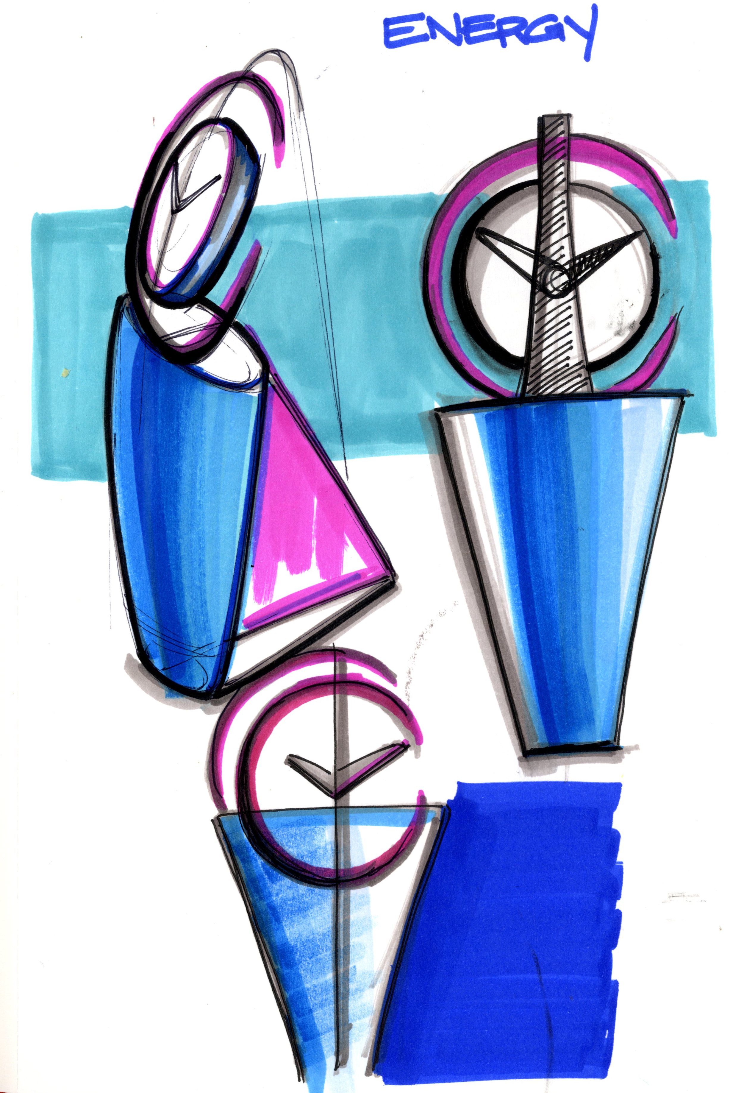
Sketching
Concept 13 was another iteration of concept 1. However, its flat face fell short during the modeling process because it did not effectively show motion from an orthographic perspective.
This was one of the concepts that caught on. The suspended clock face and propelled upward shape of the base 'moved' better than some of the other concepts.
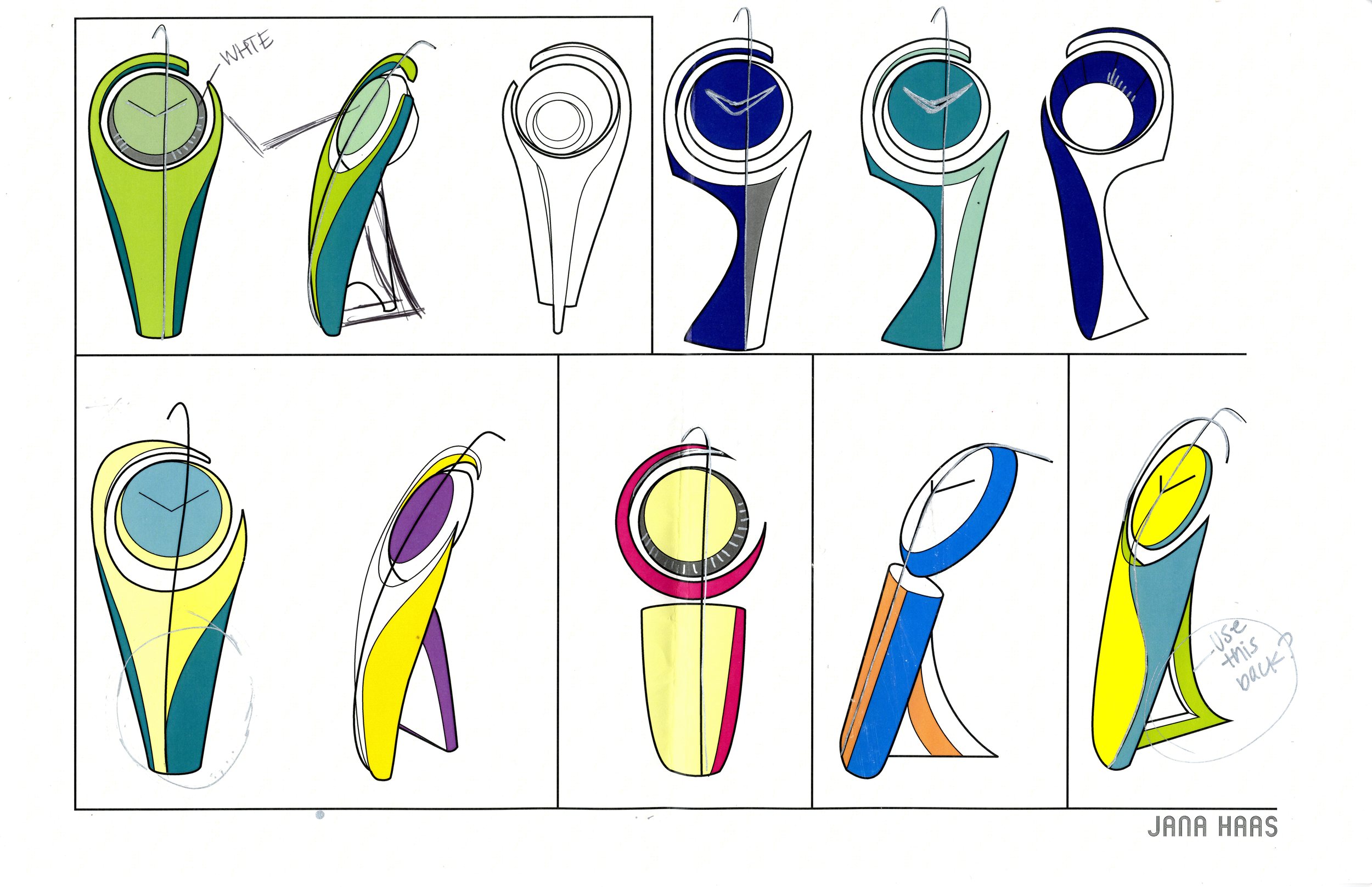
Refining sketches
More exploration of vertical analog form and how to position the centered element.
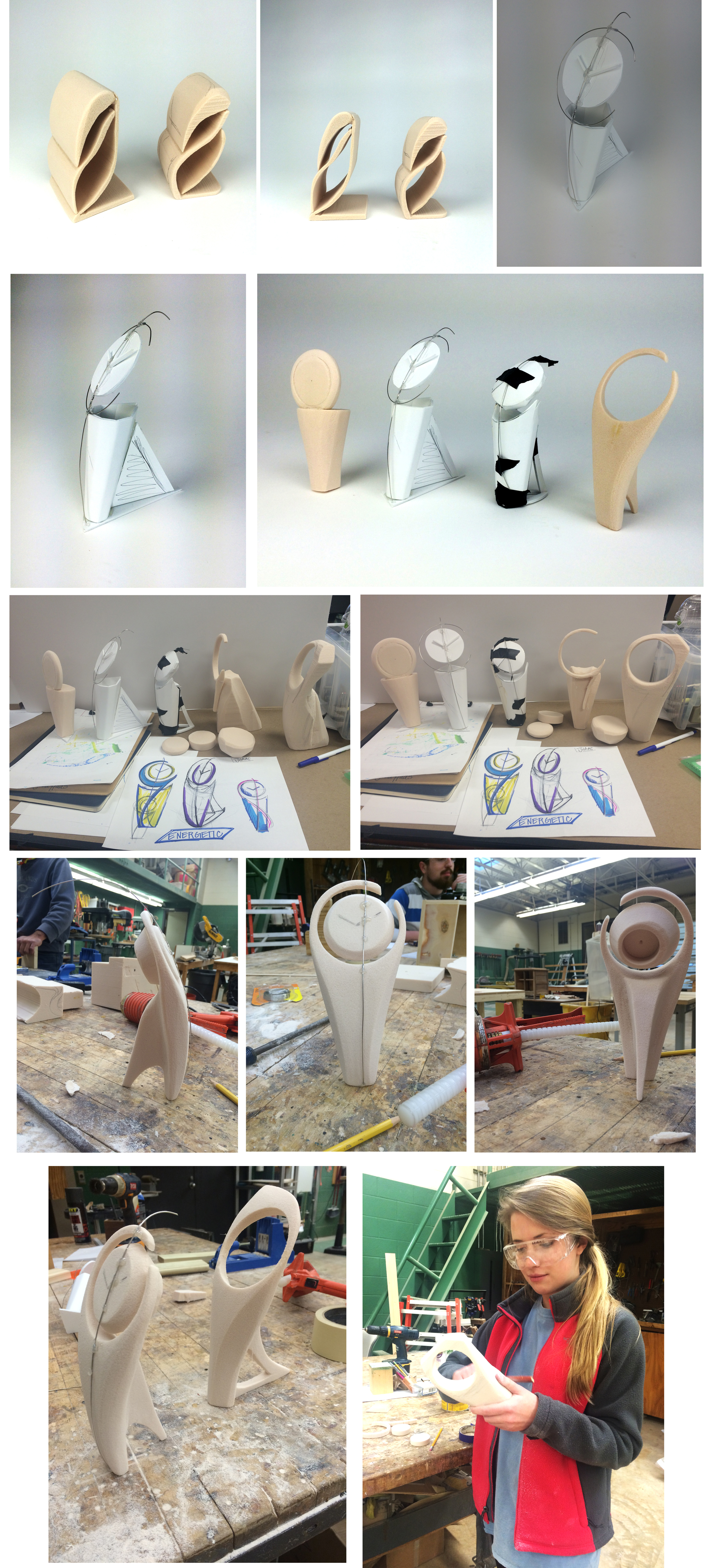
Rapid Prototyping
After deciding go ahead with the jumping analog clock with wire cutting through the middle, I developed a simplified back and base for the clock. The simplified base not only looked more streamline and communicated energy better, it also kept it from falling over.
Final decisions
I simplified the colors and the form. The center was the clock face is held up by a small pin underneath and the silver wire running vertically through the center of the clock, giving it the appearance of a floating clock face.
Final Model
Thesis Statement
When giving the adjective ‘energetic’ a physical embodiment, I began my process with brainstorming, and the thought of energy made me think of molecules and chemical reactions. Then I landed on the concept of motion, one cannot have motion without energy – and so the theme of movement stuck. In order to reach this objective of visual movement during my form giving process, I chose an organic shape that appeared to ascend or jump upward. Most of the body is vertically oriented, suspending a circular clock face with sharp pointed clock hands in the center of the form. The wire running through the center makes the front asymmetrically shape look thinner, thus making it look taller.
Diagonal movement was a common theme I discovered in excitable, energetic artwork. It gave an important direction to the composition; therefore, I decided to modify my previous iteration to include an asymmetrically point at the top. The base of the model started as an ellipse that moved awkwardly backward, but was simplified in order to achieve a more streamline aesthetic that could further emphasis the motion. To finish, I chose white, yellow, and a small amount of silver to add color to my form. The yellow was added to the sides within the parting lines, and the silver was used on the vertical wire and clock hands with the intention of the metallic element further highlighting energy. I believe my use of bright yet tasteful color, upward asymmetrical form, and suspended clock face best communicate the adjective ‘energetic.’


